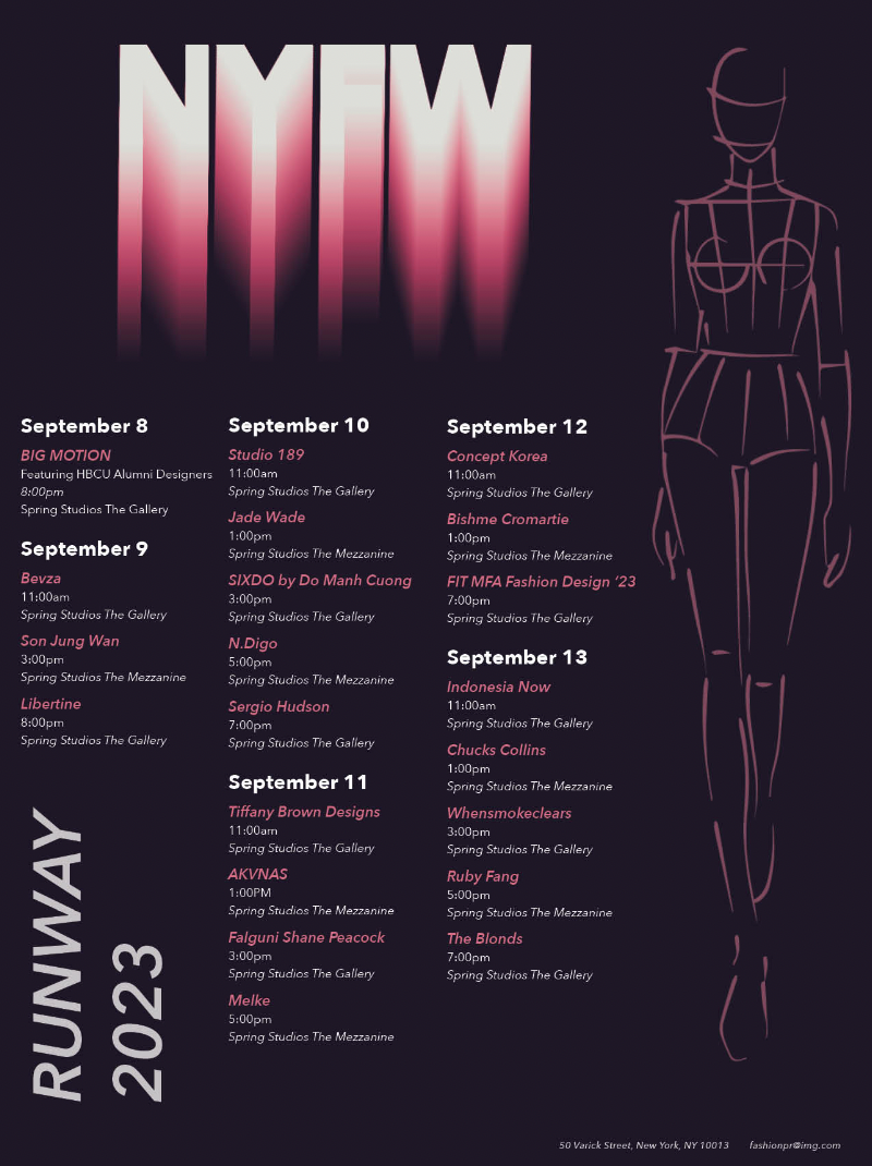
Calendar DesignRESEARCH
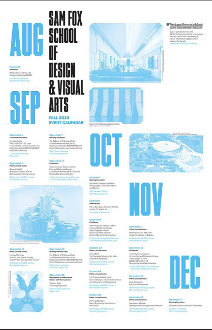
During my research for this project, Pinterest became my playground of inspiration. I was initially overwhelmed by the multitude of styles and layouts, but I managed to pick out elements from different posts that really caught my eye. I loved the bold simplicity of calendars with large, eye-catching dates and smaller text underneath. The combination of a black-and-white background with a splash of vibrant color also grabbed my attention. These design choices served as my muse, influencing the creative direction I wanted to take in my work.

TYPE & COLOR STUDIES
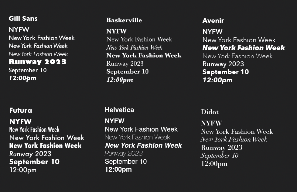
In my exploration of type studies, I deliberately honed in on type families offering a broader spectrum of options. This selection allowed me to achieve a distinct contrast when working on elements such as dates, times, events, and months. Ultimately, I gravitated towards Avenir and Baskerville, two typefaces I found to seamlessly harmonize with both a contemporary, high-fashion aesthetic and a refined, vintage couture sensibility. By using these fonts in contrast, I was able to give my designs a unique and flexible typographic style, making the project's visual story better.
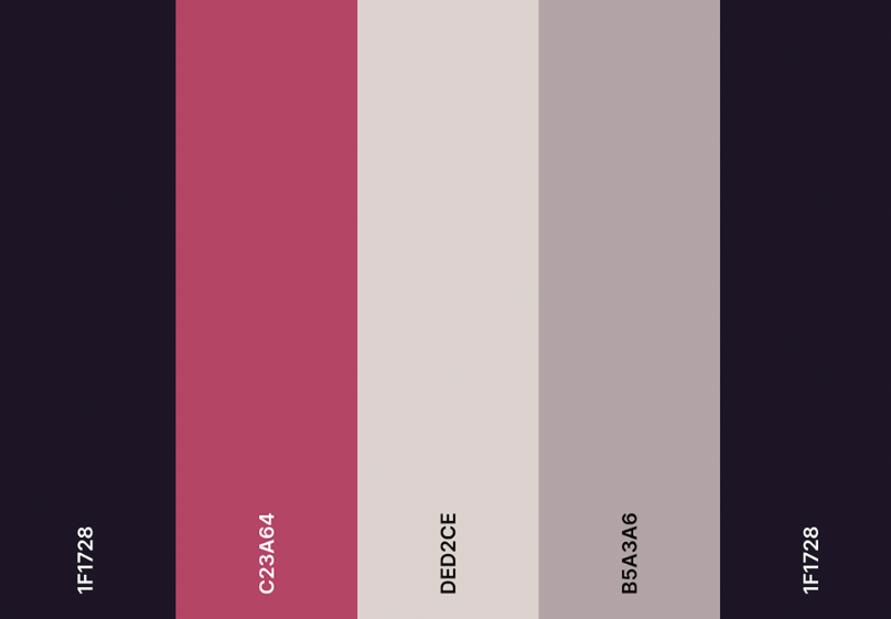
In crafting this composition, I aimed to embrace a lively color palette that revolved around various shades of purple and pink. In my younger years, I had a fondness for wearing the color pink, which naturally led me to associate this vibrant and feminine hue with the world of fashion and fashion events.
While reviewing our initial design concepts, I received valuable feedback from my peers. The standout composition that garnered the most praise was the one I revised for my final. It's worth noting that the feedback primarily centered on the overall layout rather than the choice of typeface or theme. I'm truly pleased with the final outcome, and the refinements made along the way underscore the significance of the critique process in achieving excellence.
COMPS & CRITIQUES

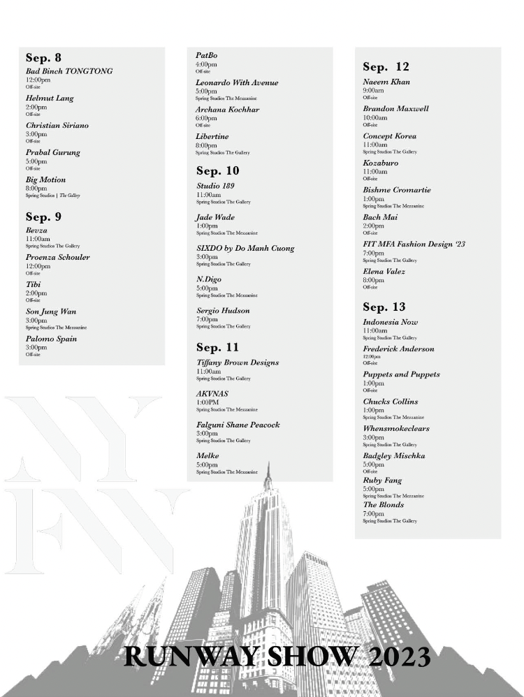
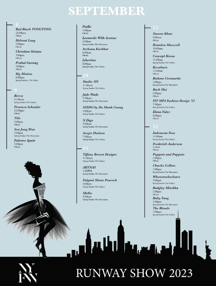
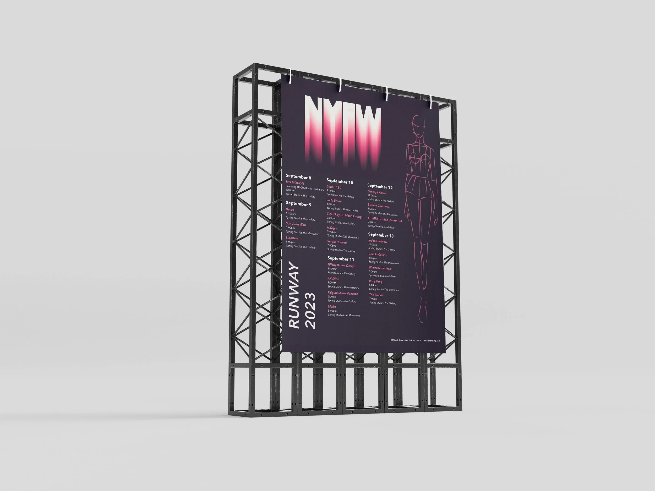
Final Design